The Matching Set Myth: Coordination Without Uniformity
Coordinate clothes without matching by linking colour, texture or proportion, so separate pieces feel connected while keeping their individual character.
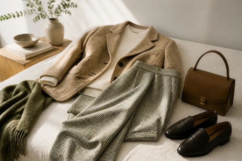
The most common mistake in coordinating clothes is treating a shared colour as a requirement for every piece. That can make an outfit feel like a uniform and leave fewer ways to wear the clothes you already own. To coordinate clothes without matching, choose one clear point of connection and let the remaining details differ.
That connection might be a colour carried in two places, a texture repeated across otherwise different garments, or a related proportion in their shapes. The right choice depends on the occasion, the pieces and how much contrast you want. Instead of asking whether every item matches, decide which quality you want the outfit to share.
Choose the connection that suits the outfit
A shared colour is easiest to recognise. Texture tends to feel quieter, while proportion is useful when colour and pattern already draw attention. Choose one as the main link; using all three equally can make an outfit feel overly arranged.
- Choose colour when the garments have different shapes or materials and need an obvious link.
- Choose texture when you want a restrained outfit with subtle depth.
- Choose proportion when the palette varies or the garments have strong patterns.
These are not rules about what can be worn together. They are ways to decide when two pieces seem unrelated, or when matching them exactly would feel too deliberate.
Use one shared colour to link separate pieces
Colour coordination does not require identical shades. A rust-coloured knit can connect with a patterned skirt that includes a small rust detail, even if the rest of the print is navy and cream. The shared hue gives the eye a route between the pieces; differences in shade, pattern and fabric keep them from reading as a set.
Look for colour in the garment itself, including a narrow stripe, a printed motif or a small trim. Accessories can make the same link, but they need not repeat the exact shade. A brown leather belt beside the warm tan in a checked jacket can feel related without appearing colour-matched.
Say you have a forest-green cardigan and a cream skirt with a fine green check. You choose the cardigan and skirt, then add plain dark shoes rather than another green accessory. The check links the garments, while the solid cardigan keeps the pattern from spreading across the outfit; the result is a visible connection without the look of a coordinated set.
When colours are close but not identical, consider their intensity as well as their names. A muted sage and a vivid emerald are both greens, but the contrast can look intentional if the stronger shade appears in a small area. If they compete, put a neutral garment between them or make one shade less prominent.
Repeat texture when colour would feel too obvious
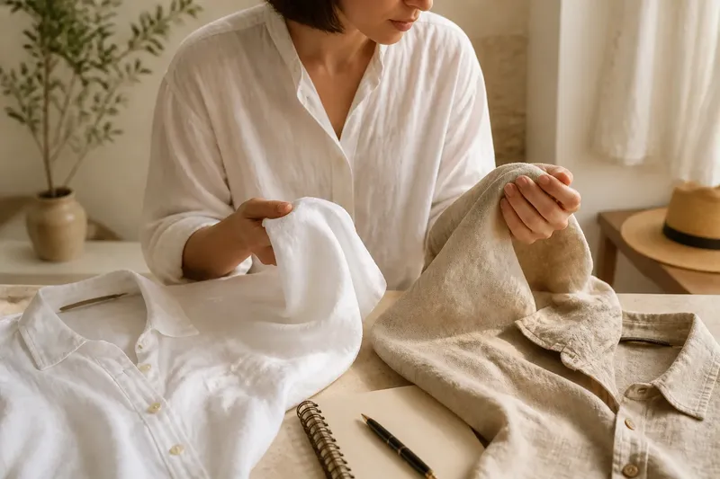
Texture is the surface character of a cloth: it may look smooth, brushed, ribbed, crisp or nubby. Repeating a texture gives an outfit a quieter connection. A ribbed top and a ribbed scarf can relate even when their colours differ, provided the other pieces give the eye some rest.
Texture need not come from identical fabrics. A softly brushed wool coat can sit comfortably beside a corduroy skirt because both have a visible nap, while their different ridges and weights prevent a matched appearance. A smooth cotton shirt underneath can provide a clean break between them.
Use this approach when you want a low-contrast outfit, especially if the colours already form a quiet palette. If the outfit has several prints, prominent textures may add needless competition; leave most surfaces smooth and choose one textured item as the point of connection.
Use related proportions when colours differ
Proportion describes how garment shapes and volumes relate: for example, a long, narrow line against a compact shape, or a loose top balanced by a closer-fitting lower half. Repeating a proportion does not mean wearing identical silhouettes. It means giving the outfit a consistent sense of scale.
A long coat and wide-leg trousers can share an elongated line, even if one is charcoal and the other is camel. A short jacket and a skirt with a defined waist create a different kind of compact shape. In either case, look at the outline from a few steps away; small details matter less than the overall relationship.
This is often the most useful link when garments have assertive colours or patterns that do not share a hue. Keep the shapes related and let the colour differences remain. If every item is loose and voluminous, the outline may lose definition; a more contained layer, such as a fitted top, can give the larger shapes a clear point of contrast.
How can you coordinate clothes without matching?
How can I coordinate clothes without matching colours?
Choose a shared texture or a related silhouette instead. A nubby jacket and a ribbed knit can connect through surface, while different colours keep the outfit from looking like a set.
What should I do when a print has several colours?
Pick one colour from the print and echo it in a plain garment or accessory. Keep the other pieces simple so the print remains the main source of detail.
Can shoes or a bag create the connection?
Yes, when the accessory relates to a colour, texture or finish already present. A tan bag can repeat the warm note in a checked jacket, but an unrelated accessory colour may introduce a second competing link.
How do I make a coordinated outfit feel less formal?
Keep the point of connection, then vary the fabric, finish or degree of structure. A neat jacket with a relaxed cotton top, for example, retains a shared colour while avoiding the stiffness of identical, highly polished pieces.
Adjust the link to the occasion
For a setting that calls for polish, make the connection easy to see and keep competing details modest. A navy jacket and a patterned blouse with a small navy motif can look composed without matching trousers. A shoe or belt in a different neutral can preserve the clean effect while adding separation.
For a casual day, the shared element can be less exact. A faded blue in a checked overshirt may sit alongside blue denim, while differences in wash and fabric make the combination feel easy rather than uniform. If both pieces are visually strong, add a plain layer to create a pause.
For an outfit built around a statement item, let that piece lead. With a brightly patterned skirt, choose a top that repeats one quieter colour in the print, then avoid echoing every accent. The connection remains readable without making the outfit compete with itself.
Check the whole outfit before adding another link
Stand back from a mirror and notice where your eye goes first. If it jumps between competing details, remove or simplify one element rather than adding another matching accessory. If the pieces seem disconnected, strengthen one shared quality instead of repeating several colours at once.
Lighting can change how colours appear, so check the outfit near a window if a combination looks uncertain indoors. You can also place the garments side by side on a bed or hanger to compare their surfaces and shapes without the distraction of other styling details. The aim is not perfect correspondence; it is a clear relationship that still lets each piece look like itself.
When coordinating clothes without matching, settle on one link first: colour, texture or proportion. Then let the remaining pieces differ in a way that suits the occasion. This keeps the outfit connected while leaving room for each garment to retain its own character.